
Apple’s Graphic Failure
2013.01.20 prev next
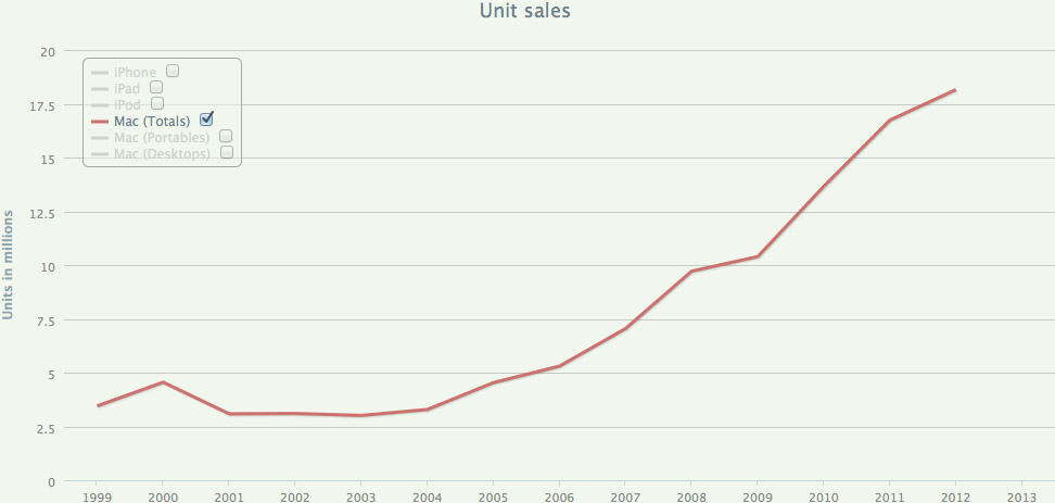
FROM Bare Figures, here’s Mac unit sales over the past dozen years:
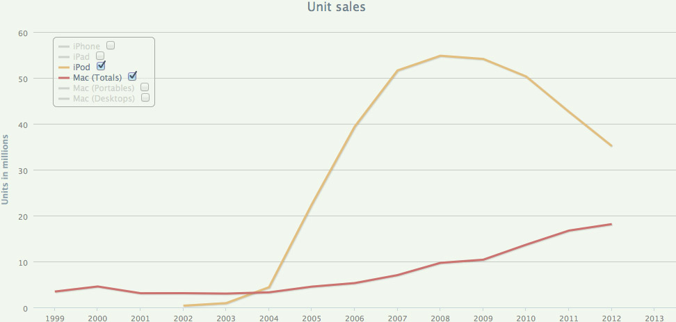
Here’s the same graph with iPods added:
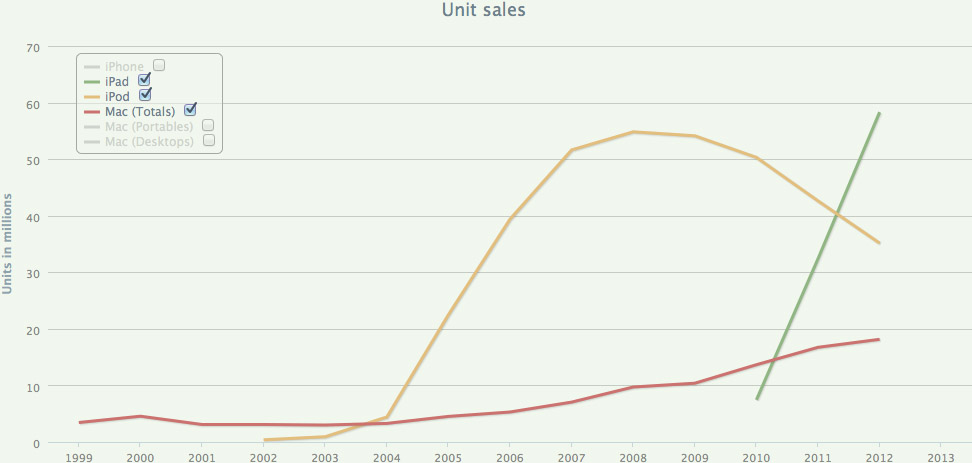
Here it is with iPads:
And finally, with iPhones too:
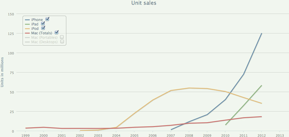
Notice that all of these graphs have something in common. Except for the iPod, they’re all currently going up. And except for the iPod’s sudden rocket-blast-off around 2004-2005, there’s almost no sudden change in direction. The trajectories are all very consistent, and experience only gradual change in direction over a period of several years.
This all strongly suggests, of course, that Apple is very unlikely to find itself in any kind of serious trouble for many years to come, at least. But you wouldn’t know it to read many pundits’ dire predictions of near-term Apple decline.
Graphic Failure
Most of these down-on-Apple commentators don’t grace us with a graph of their predictions, but every now and then they do. Here’s exactly such a graph from Pyramid Research:
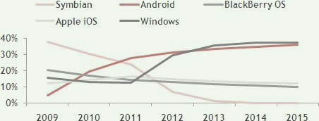
Graphs look authoritative, don’t they? And this one seems to indicate that Windows and Android will be neck-and-neck winners in the mobile computing space (Windows arbitrarily slightly ahead of Android), iOS and Blackberry will be tied for a very distant third-and-fourth place, and Symbian will be dead and forgotten.
Now, let’s draw some lines over this graph and see what’s happening with it:

The green line represents the present, i.e. when the graph was created. Everything to the left of the green line is actual data (perhaps skewed with “shipments” tricks, but for the sake of the argument, we’ll assume it’s valid). Everything to the right of the green line is predictions (projections, forecasts, whatever).
The emphasized line represents Android. As you can see, up to the present it is increasing, but progressively more slowly. And after the green line, it continues to do exactly that, with no noticeable inflection point at the green line. So this can be considered a reasonable projection of the past into the future. Of course, there’s no guarantee that that’s exactly what will happen. And the farther you project the past into the future, the less likely it will be to happen that way. (And this graph projects pretty far into the future, you’ll notice.) But still — a reasonable projection.
Next, here’s what they did for BlackBerry:

Again, a reasonable projection. The line is going down, but progressively more slowly. The future line continues that same trend with no noticeable change.
Now — here’s Symbian:

That’s weird. Why the big inflection point right at the present? Don’t get me wrong; at the time this graph was made, I had no quibble with the general idea that Symbian was in severe decline, nor that it would be effectively dead several years later. Nor do I dispute that thesis today. But still — why the big change in direction right at the green line — the time when the graph was created? That’s very suspicious. I suggest that this big dip is necessary to make the graph add up to 100% over its whole range: What we’re about to see below (regarding iOS and Windows) is why Symbian has to take a suddenly steeper dive at the green line.
Now for iOS:

The past showed iOS climbing at a slightly increasing rate. Then suddenly, at the green line, it changes direction to downward. And does so at just the right speed so that it can be arbitrarily ahead of BlackBerry but otherwise as small as possible.
All of these predictions leave just enough room in the 100% total for Windows to do this:

It takes a huge and abrupt upturn at the green line, and winds up barely in first place, just the tiniest bit ahead of Android.
Now, I leave it to the reader to ponder: What are the chances that this graph was made by any predictive technique more sophisticated than, “Somehow, we have to predict market victory for Microsoft. How can we bend and twist these lines to make that outcome occur, while still keeping the graph total at 100%?”
Backhanded Compliment
Even when market analysts seem to be saying something positive about Apple, it’s not always so. Consider this graph of “iPhone Estimated Installed Base” from Rob Cihra of Evercore Partners:
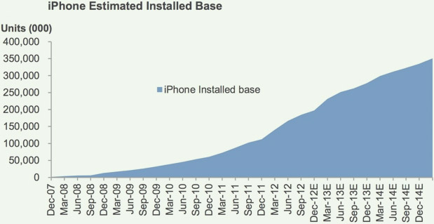
Hey, that looks positive, doesn’t it? Climbing at a nice, healthy rate. No abrupt downturns. What could be anti-Apple about that?
But notice that the graph’s title included the word “Estimated.” And notice all those “E”s starting in December of 2012 — they’re easy to overlook, and they’re the only indication that those quarters are “estimated,” not actual. So now take a look at the exact same graph with a big, fat, green present-line on it, plus a reasonable (my freehand) continuation of the past into the future:
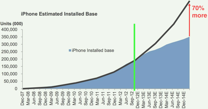
Ugh. The reasonable projection turns out to be about 70% greater than Cihra’s “estimate.” His graph has no obvious change in direction that pops out as in Pyramid’s, but still: an arbitrary and massive reduction in Apple’s future potential, with no basis in past performance.
Future Uncertain
Now, again — and I can’t emphasize this enough — I have no way of knowing what Apple’s future holds. It might be much better than a reasonable projection of its past, or it might be much worse. It might even be worse than Pyramid and Evercore said it would be; who knows?
My point is simply that when you look at forecasts of how Apple and its competitors will be doing in the next several years, keep in mind that there’s a good chance that the forecast is being made by people who have little or no interest in how their predictions will look a few years from now. They simply want to be negative about Apple today, and they use their analyst position to do so.

Update 2013.09.10 — The Wall Street Journal’s recent graphs showing the very-near-future of all three iOS devices:
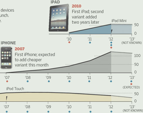
To their credit, they’re going only one year (or less) out, and they make the not-actual-data portion very visibly different from the actual-data portion. And the iPod Touch curve is only the tiniest bit worse than a reasonable projection of its very smooth, many-year curve. But what’s up with the other two graphs? Can you say, “massive downward-bending cusp at the now-line, with no other noticeable cusp in the history of the product?” I knew you could.
prev next
Hear, hear
prev next
Best recent articles
Make Your Own FBI Backdoor, Right Now
Polygon Triangulation With Hole
The Legacy of Windows Phone
Palm Fan
Vivek Wadhwa, Scamster Bitcoin Doomsayer
Fanboy Features (regularly updated)
When Starting A Game of Chicken With Apple, Expect To Lose — hilarious history of people who thought they could bluff Apple into doing whatever they wanted.
A Memory of Gateway — news chronology of Apple’s ascendancy to the top of the technology mountain.
iPhone Party-Poopers Redux and Silly iPad Spoilsports — amusing litanies of industry pundits desperately hoping iPhone and iPad will go away and die.
Embittered Anti-Apple Belligerents — general anger at Apple’s gi-normous success.
RSS FEED
My books
Now available on Apple Books!


Links
Daring Fireball
The Loop
RoughlyDrafted
Macalope
Red Meat
Despair, Inc.
Real Solution #9 (Mambo Mania Mix) over stock nuke tests. (OK, somebody made them rip out the music — try this instead.)
Ernie & Bert In Casino
Great Explanation of Star Wars
Best commercials (IMO) from Super Bowl 41, 43, 45, 46, 47, 53 and 55
Kirk & Spock get Closer
American football explained.
TV: Severance; Succession; The Unlikely Murderer; Survivor; The Jinx; Breaking Bad; Inside Amy Schumer
God’s kitchen
Celebrity Death Beeper — news you can use.
Making things for the web.
RedQueenCoder.
My vote for best commercial ever. (But this one’s a close second, and I love this one too.)
Recent commercials I admire: KFC, Audi, Volvo
Best reggae song I’ve discovered in quite a while: Virgin Islands Nice
Aquarium by Saint-Saëns. What a superb performance, easily the equal of the Bernstein recording I grew up with. And so nice to see it performed up close in a high-quality video. But how awful when YouTube popovers spoil the final seconds, and an incredibly loud ad starts playing as soon as the music stops. Sickening. I guess this is the price we pay for having free, immediate access to such beautiful works of art.
d120 dice: You too (like me) can be the ultimate dice nerd.
WiFi problems? I didn’t know just how bad my WiFi was until I got eero.
Favorite local pad thai: Pho Asian Noodle on Lane Ave. Yes, that place; blame Taco Bell for the amenities. Use the lime, chopsticks, and sriracha. Yummm.
Um, could there something wrong with me if I like this? Or this?
Reggae recreation of Ozzy singing Iron Man. The cheery melancholy of the style, and the clarity of the lyrics, make the story sadder and realer to me.
This entire site as a zip file — last updated 2025.09.03
Previous articles
The West Coast Is Totally Doomed
Malicious Requirement, Non-Malicious Compliance
Well-Regulated Militia
Stroking Their Bruised Egos
EU vs Apple
Scioto Grove Tower NOPE
Fitness Startup Is Hard
Sweeney Translation
Collatz, Revisited
Downtown Isn’t Coming Back
Stig
Gaston
Nuclear War
Wolfspeare
Engström’s Motive
Google’s Decision
Warrening
The Two Envelopes Problem, Solved
The Practical Smartphone Buyer
Would Apple Actually Exit the EU Or UK?
See You Looked
Blackjack Strategy Card (Printable)
Swan Device 1956 — Probable Shape
Pu
RGB-To-Hue Conversion
Polygon Triangulation With Hole
One-Point Implosion: “Palm Fan”
Implosion: Were Those Two-Speed Lenses Really Necessary?
Apple Wants User/Developer Choice; Its Enemies Want Apple Ruin
Tim Sweeney Plays Dumb
The Jury of One
The Lesson of January 6
Amnesia Is Not A Good Plot
I Was Eating for 300 lbs, Not 220
Action Arcade Sounds and Reality
The Flea Market and the Retail Store
Squaring the Impossible
Yes, Crocodiles Are Dinosaurs — Duh
Broccoli and Apples Are Not the Antidote To Donuts and Potato Chips
Cydia and “Competition”
The Gift of Nukes
Prager University and the Anti-Socialists’ Big Blind Spot
In Defense of Apple’s 30% Markup, Part 2
In Defense of Apple’s 30% Markup
Make Your Own FBI Backdoor, Right Now
Storm
The Legacy of Windows Phone
Mindless Monsters
To the Bitter End
“Future Shock” Shock
Little Plutonium Boy
The iPhone Backdoor Already Exists
The Impulse To Be Lazy
HBO’s “Meth Storm” BS
Judos vs. Pin Place
Vizio M-Series 65" LCD (“LED”) TV — Best Settings (IMHO)
Tasting Vegemite (Bucket List)
The IHOP Coast
The Surprise Quiz Paradox, Solved
Apple, Amazon, Products, and Services — Not Even Close
Nader’s Open Blather
Health — All Or Nothing?
Vivek Wadhwa, Scamster Bitcoin Doomsayer
Backwards Eye Wiring — the Optical Focus Hypothesis
Apple’s Cash Is Not the Key
Nothing More Angry Than A Cornered Anti-Apple
Let ’Em Glow
The Ultimate, Simple, Fair Tax
Compassion and Vision
When Starting A Game of Chicken With Apple, Expect To Lose
The Caveat
Superb Owl
NavStar
Basic Reproduction Number
iBook Price-Fixing Lawsuit Redux — Apple Won
Delusion Made By Google
Religion Is A Wall
It’s Not A Criticism, It’s A Fact
Michigan Wolverines 2014 Football Season In Review
Sprinkler Shopping
Why There’s No MagSafe On the New MacBook
Sundar Pichai Says Devices Will Fade Away
The Question Every Apple Naysayer Must Answer
Apple’s Move To TSMC Is Fine For Apple, Bad For Samsung
Method of Implementing A Secure Backdoor In Mobile Devices
How I Clip My Cat’s Nails
Die Trying
Merger Hindsight
Human Life Decades
Fire and the Wheel — Not Good Examples of A Broken Patent System
Nobody Wants Public Transportation
Seasons By Temperature, Not Solstice
Ode To Coffee
Starting Over
FaceBook Messenger — Why I Don’t Use It
Happy Birthday, Anton Leeuwenhoek
Standard Deviation Defined
Not Hypocrisy
Simple Guide To Progress Bar Correctness
A Secure Backdoor Is Feasible
Don’t Blink
Predictive Value
Answering the Toughest Question About Disruption Theory
SSD TRIM Command In A Nutshell
The Enderle Grope
Aha! A New Way To Screw Apple
Champagne, By Any Other Maker
iOS Jailbreaking — A Perhaps-Biased Assessment
Embittered Anti-Apple Belligerents
Before 2001, After 2001
What A Difference Six Years Doesn’t Make
Stupefying New Year’s Stupidity
The Innovator’s Victory
The Cult of Free
Fitness — The Ultimate Transparency
Millions of Strange Devotees and Fanatics
Remember the iPod Killers?
Theory As Simulation
Four Analysts
What Was Christensen Thinking?
The Grass Is Always Greener — Viewing Angle
Is Using Your Own Patent Still Allowed?
The Upside-Down Tech Future
Motive of the Anti-Apple Pundit
Cheating Like A Human
Disremembering Microsoft
Security-Through-Obscurity Redux — The Best of Both Worlds
iPhone 2013 Score Card
Dominant and Recessive Traits, Demystified
Yes, You Do Have To Be the Best
The United States of Texas
Vertical Disintegration
He’s No Jobs — Fire Him
A Players
McEnroe, Not Borg, Had Class
Conflict Fades Away
Four-Color Theorem Analysis — Rules To Limit the Problem
The Unusual Monopolist
Reasonable Projection
Five Times What They Paid For It
Bypassable Security Certificates Are Useless
I’d Give My Right Arm To Go To Mars
Free Advice About Apple’s iOS App Store Guidelines
Inciting Violence
One Platform
Understanding IDC’s Tablet Market Share Graph
I Vote Socialist Because...
That Person
Product Naming — Google Is the Other Microsoft
Antecessor Hypotheticum
Apple Paves the Way For Apple
Why — A Poem
App Anger — the Supersized-Mastodon-In-the-Room That Marco Arment Doesn’t See
Apple’s Graphic Failure
Why Microsoft Copies Apple (and Google)
Coders Code, Bosses Boss
Droidfood For Thought
Investment Is Not A Sure Thing
Exercise is Two Thirds of Everything
Dan “Real Enderle” Lyons
Fairness
Ignoring the iPod touch
Manual Intervention Should Never Make A Computer Faster
Predictions ’13
Paperless
Zeroth — Why the Century Number Is One More Than the Year Number
Longer Than It Seems
Partners: Believe In Apple
Gun Control: Best Arguments
John C. Dvorak — Translation To English
Destructive Youth
Wiens’s Whine
Free Will — The Grand Equivocation
What Windows-vs.-Mac Actually Proved
A Tale of Two Logos
Microsoft’s Three Paths
Amazon Won’t Be A Big Winner In the DOJ’s Price-Fixing Suit
Infinite Sets, Infinite Authority
Strategy Analytics and Long Term Accountability
The Third Stage of Computing
Why 1 Isn’t Prime, 2 Is Prime, and 2 Is the Only Even Prime
Readability BS
Lie Detection and Psychos
Liking
Steps
Microsoft’s Dim Prospects
Humanity — Just Barely
Hanke-Henry Calendar Won’t Be Adopted
Collatz Conjecture Analysis (But No Proof; Sorry)
Rock-Solid iOS App Stability
Microsoft’s Uncreative Character
Microsoft’s Alternate Reality Bubble
Microsoft’s Three Ruts
Society’s Fascination With Mass Murder
PlaysForSure and Wikipedia — Revisionism At Its Finest
Procrastination
Patent Reform?
How Many Licks
Microsoft’s Incredible Run
Voting Socialist
Darwin Saves
The Size of Things In the Universe
The Self-Fulfilling Prophecy That Wasn’t
Fun
Nobody Was In Love With Windows
Apples To Apples — How Anti-Apple Pundits Shoot Themselves In the Foot
No Holds Barred
Betting Against Humanity
Apple’s Premium Features Are Free
Why So Many Computer Guys Hate Apple
3D TV With No Glasses and No Parallax/Focus Issues
Waves With Particle-Like Properties
Gridlock Is Just Fine
Sex Is A Fantasy
Major Player
Why the iPad Wannabes Will Definitely Flop
Predators and Parasites
Prison Is For Lotto Losers
The False Dichotomy
Wait and See — Windows-vs-Mac Will Repeat Itself
Dishonesty For the Greater Good
Barr Part 2
Enough Information
Zune Is For Apple Haters
Good Open, Bad Open
Beach Bodies — Who’s Really Shallow?
Upgrade? Maybe Not
Eliminating the Impossible
Selfish Desires
Farewell, Pirate Cachet
The Two Risk-Takers
Number of Companies — the Idiocy That Never Dies
Holding On To the Solution
Apple Religion
Long-Term Planning
What You Have To Give Up
The End of Elitism
Good and Evil
Life
How Religion Distorts Science
Laziness and Creativity
Sideloading and the Supersized-Mastodon-In-the-Room That Snell Doesn’t See
Long-Term Self-Delusion
App Store Success Won’t Translate To Books, Movies, and Shows
Silly iPad Spoilsports
I Disagree
Five Rational Counterarguments
Majority Report
Simply Unjust
Zooman Science
Reaganomics — Like A Diet — Works
Free R&D?
Apple’s On the Right Track
Mountains of Evidence
What We Do
Hope Conquers All
Humans Are Special — Just Not That Special
Life = Survival of the Fittest
Excuse Me, We’re Going To Build On Your Property
No Trademark iWorries
Knowing
Twisted Excuses
The Fall of Google
Real Painters
The Meaning of Kicking Ass
How To Really Stop Casual Movie Disc Ripping
The Solitary Path of the High-Talent Programmer
Fixing, Not Preaching
Why Blackmail Is Still Illegal
Designers Cannot Do Anything Imaginable
Wise Dr. Drew
Rats In A Too-Small Cage
Coming To Reason
Everything Isn’t Moving To the Web
Pragmatics, Not Rights
Grey Zone
Methodologically Dogmatic
The Purpose of Language
The Punishment Defines the Crime
Two Many Cooks
Pragmatism
One Last Splurge
Making Money
What Heaven and Hell Are Really About
America — The Last Suburb
Hoarding
What the Cloud Isn’t For
Diminishing Returns
What You’re Seeing
What My Life Needs To Be
Taking An Early Retirement
Office Buildings
A, B, C, D, Pointless Relativity
Stephen Meyer and Michael Medved — Where Is ID Going?
If You Didn’t Vote — Complain Away
iPhone Party-Poopers Redux
What Free Will Is Really About
Spectacularly Well
Pointless Wrappers
PTED — The P Is Silent
Out of Sync
Stupid Stickers
Security Through Normalcy
The Case For Corporate Bonuses
Movie Copyrights Are Forever
Permitted By Whom?
Quantum Cognition and Other Hogwash
The Problem With Message Theory
Bell’s Boring Inequality and the Insanity of the Gaps
Paying the Rent At the 6 Park Avenue Apartments
Primary + Reviewer — An Alternative IT Plan For Corporations
Yes Yes Yes
Feelings
Hey Hey Whine Whine
Microsoft About Microsoft Visual Microsoft Studio Microsoft
Hidden Purple Tiger
Forest Fair Mall and the Second Lamborghini
Intelligent Design — The Straight Dope
Maxwell’s Demon — Three Real-World Examples
Zealots
Entitlement BS
Agenderle
Mutations
Einstein’s Error — The Confusion of Laws With Their Effects
The Museum Is the Art
Polly Sooth the Air Rage
The Truth
The Darkness
Morality = STDs?
Fulfilling the Moral Duty To Disdain
MustWinForSure
Choice
Real Design
The Two Rules of Great Programming
Cynicism
The End of the Nerds
Poverty — Humanity’s Damage Control
Berners-Lee’s Rating System = Google
The Secret Anti-MP3 Trick In “Independent Women” and “You Sang To Me”
ID and the Large Hadron Collider Scare
Not A Bluff
The Fall of Microsoft
Life Sucks When You’re Not Winning
Aware
The Old-Fashioned Way
The Old People Who Pop Into Existence
Theodicy — A Big Stack of Papers
The Designed, Cause-and-Effect Brain
Mosaics
IC Counterarguments
The Capitalist’s Imaginary Line
Education Isn’t Everything
I Don’t Know
Funny iPhone Party-Poopers
Avoiding Conflict At All Costs
Behavior and Free Will, Unconfused
“Reduced To” Absurdum
Suzie and Bubba Redneck — the Carriers of Intelligence
Everything You Need To Know About Haldane’s Dilemma
Darwin + Hitler = Baloney
Meta-ware
Designed For Combat
Speed Racer R Us
Bold — Uh-huh
Conscious of Consciousness
Future Perfect
Where Real and Yahoo Went Wrong
The Purpose of Surface
Eradicating Religion Won’t Eradicate War
Documentation Overkill
A Tale of Two Movies
The Changing Face of Sam Adams
Dinesh D’Souza On ID
Why Quintic (and Higher) Polynomials Have No Algebraic Solution
Translation of Paul Graham’s Footnote To Plain English
What Happened To Moore’s Law?
Goldston On ID
The End of Martial Law
The Two Faces of Evolution
A Fine Recommendation
Free Will and Population Statistics
Dennett/D’Souza Debate — D’Souza
Dennett/D’Souza Debate — Dennett
The Non-Euclidean Geometry That Wasn’t There
Defective Attitude Towards Suburbia
The Twin Deficit Phantoms
Sleep Sync and Vertical Hold
More FUD In Your Eye
The Myth of Rubbernecking
Keeping Intelligent Design Honest
Failure of the Amiga — Not Just Mismanagement
Maxwell’s Silver Hammer = Be My Honey Do?
End Unsecured Debt
The Digits of Pi Cannot Be Sequentially Generated By A Computer Program
Faster Is Better
Goals Can’t Be Avoided
Propped-Up Products
Ignoring ID Won’t Work
The Crabs and the Bucket
Communism As A Side Effect of the Transition To Capitalism
Google and Wikipedia, Revisited
National Geographic’s Obesity BS
Cavemen
Theodicy Is For Losers
Seattle Redux
Quitting
Living Well
A Memory of Gateway
Is Apple’s Font Rendering Really Non-Pixel-Aware?
Humans Are Complexity, Not Choice
A Subtle Shift
Moralism — The Emperor’s New Success
Code Is Our Friend
The Edge of Religion
The Dark Side of Pixel-Aware Font Rendering
The Futility of DVD Encryption
ID Isn’t About Size or Speed
Blood-Curdling Screams
ID Venn Diagram
Rich and Good-Looking? Why Libertarianism Goes Nowhere
FUV — Fear, Uncertainty, and Vista
Malware Isn’t About Total Control
Howard = Second Coming?
Doomsday? Or Just Another Sunday
The Real Function of Wikipedia In A Google World
Objective-C Philosophy
Clarity From Cisco
2007 Macworld Keynote Prediction
FUZ — Fear, Uncertainty, and Zune
No Fear — The Most Important Thing About Intelligent Design
How About A Rational Theodicy
Napster and the Subscription Model
Intelligent Design — Introduction
The One Feature I Want To See In Apple’s Safari.


 design by